
Code and Coordinates
engineering at Geocodio
Creating A Choropleth Map with MapLibre
Learnings from working with MapLibre's Choropleth styling options
By Cory Stine
Last month, Geocodio started beta testing a new data append called FFIEC CRA/HMDA Data, which retrieves key datapoints from the FFIEC flat file. It was designed to assist financial institutions, lenders and other organizations that need to comply with fair lending regulations.
As soon as it launched, I began thinking about interesting ways to utilize this new data. I was reminded of previous conversations with customers who were looking to visualize the income levels of specific Census tracts in order to assess their Community Reinvestment Act compliance, support funding requests with mapped data showing community needs, or identify strategic locations for new service offerings in underserved neighborhoods. The new data append contained exactly the information needed to accomplish these types of tasks.
While our Maps tool already provides the option to add select boundary layers, including Census Tracts, these layers didn’t factor in any outside data besides the polygon information. Customers could add basic customization options, but nothing as complex as shading a tract based on income level.
To address this need, I used MapLibre’s Choropleth styling options to create a new layer option that incorporates FFIEC Income Indicator data to colorize each tract polygon.
Perhaps you might need to create a choropleth map at some point. In the spirit of helping you avoid some of my pitfalls, let’s take a closer look at how I put this all together.
Understanding Choropleth Maps
A choropleth map uses different colors to display statistical patterns across a variety of regions, with each color representing a different range of results. It’s sort of like a heatmap, except instead of visualizing the density of data points, it shows a range across geographic regions. For example, you might have a dataset with the percentage of the population that is a veteran by county, expressed in ranges. By contrast, on a heatmap you might have individual data points for each veteran, and the heatmap would visualize their density. Sometimes it’s useful to show data at the individual level and use a heatmap (for example, “If we can only open one new hospital for veterans, where is the most veteran-dense area without a veterans’ hospital?”), whereas other times, the ranges are more helpful, and a choropleth would be more appropriate (“Do we have hospitals in all of the areas that have a veteran population greater than 10% of the population?”).
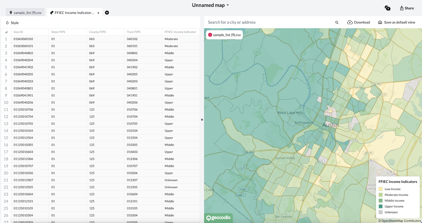
My goal was to match each Census tract to its corresponding income level. The source data for this was our new FFIEC append and I used it to determine which color to render each associated polygon.
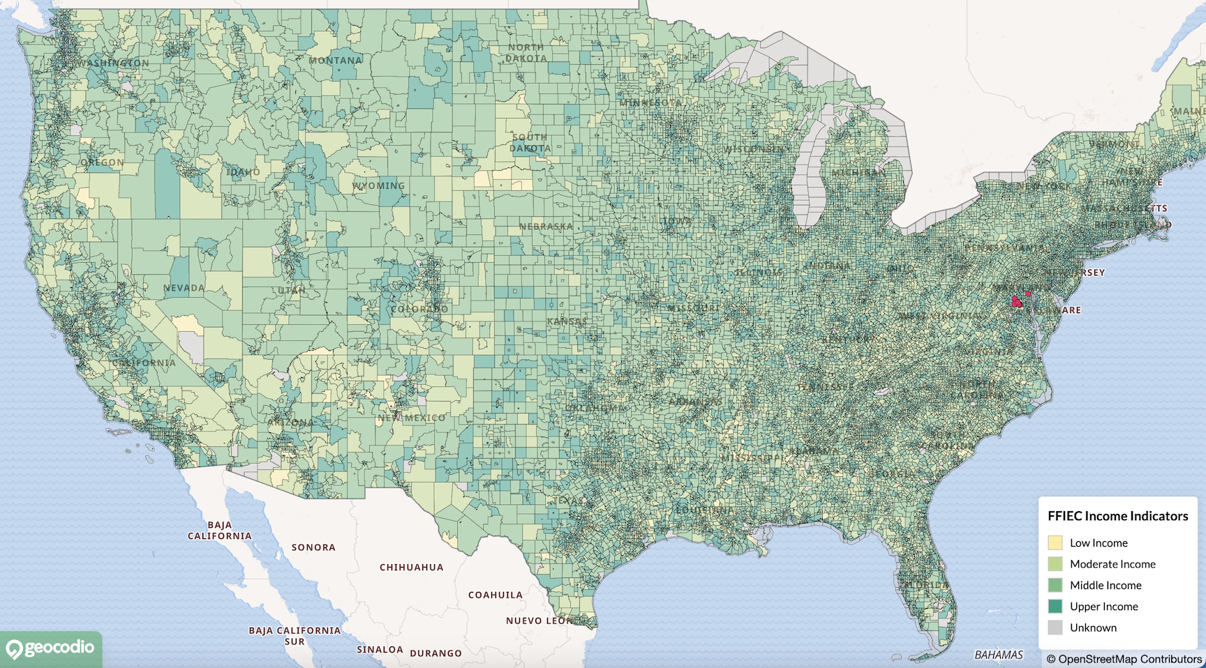
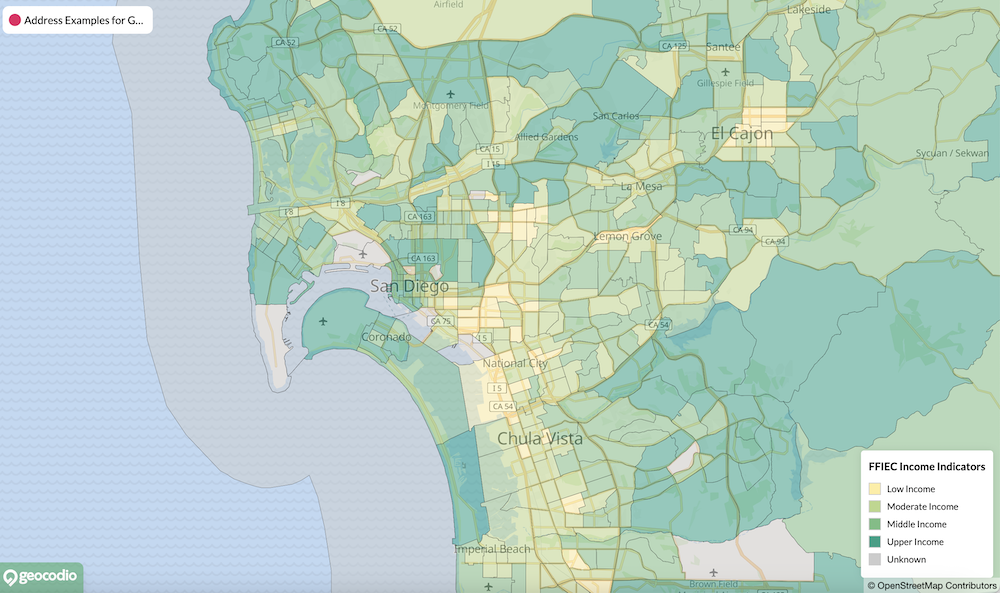
The FFIEC classifies household income into five categories: Low, Moderate, Middle, Upper, and Unknown.
To retrieve these indicators, I joined our existing Census tract layer with the boundary layers file and updated the GeoJSON source to include the income level data from the FFIEC flat file. The source link would be passed into the url key within parameters. These new values would allow for conditional styling of each tract.
    {
        id: 'ffiec-income-tracts',
        icon: 'https://maps-assets.geocod.io/boundaries/ffiec-income-tracts.png',
        type: 'LIBRARY',
        year: '2024',
        category: 'Census',
        country: 'us',
        parameters: {
            url: …,
        },
        title: 'FFIEC Income Indicators',
        description: 'All US Census Tracts, shaded by FFIEC income indicators.',
    },
Rendering the Choropleth Layer
The innate uniqueness of the FFIEC Income Indicators layer required a re-thinking of how we render all of our boundary layers.
We could no longer apply a blanket default color to every boundary which could then be customized by the user. Rather, in this instance, we needed to lock the color styling in place to accurately reflect the income classification of each tract.
An existing paint variable handled all of the color styling for the other layers:
    let paint = {
       'fill-color': polygon.options.fillStyle || 'rgba(255, 255, 255, 0)',
       'fill-opacity': [
         'case',
         ['boolean', ['feature-state', 'hover'], false],
         1,
         polygon.options.opacity,
       ],
    }

    this.map.addLayer({
       'id': layerName,
       'type': 'fill',
       'source': sourceName,
       'source-layer': sourceLayerName,
       'paint': paint,
    }, firstMarkerLayerId)
For our new choropleth layer, I updated the paint variable when the source layer name matched 'ffiecincometracts':
    if (sourceLayerName === 'ffiecincometracts') {
       paint = {
         'fill-color': [
           'match',
           ['get', 'FFIEC Income Indicator'],
           'Low', '#FFEDA0', // Purple for low income
           'Moderate', '#B9D788', // Orange for moderate income
           'Middle', '#72BE82', // Teal/green for middle income
           'Upper', '#16A085', // Gold for upper income
           'Unknown', '#CCCCCC', // Gray for unknown
           '#AAAAAA',  // Default gray
         ],
          'fill-opacity': [
           'case',
           ['boolean', ['feature-state', 'hover'], false],
           1,
           polygon.options.opacity,
         ],
        }
    }
Instead of setting the fill-color option to a single, customizable color, this new variation of paint supplies an array where:
The first item in the array,
match, informs MapLibre to compare an input value against multiple possible output values. In this case, the output value the input matches will determine which color to use.The second item in the array,
['get', 'FFIEC Income Indicator'], retrieves the value of the ‘FFIEC Income Indicator’ property for each tract.The rest of the items provide an input (the income level identified in each tract) and an output (the color to use when a specific income level is retrieved).
As a side note, in my conditional, you may notice that the string I’m using as a comparison (‘ffiecincomeindicators’) does not actually match the name of the layer in the boundary file (‘ffiec-income-indicators’). This is because vector tile source layers in MapLibre have specific naming conventions that don't always match my URL path segments. As such, I transform the incoming layer’s id to remove the dashes in sourceLayerName before using it in my conditional statement.
const sourceLayerName = polygon.url.substring(polygon.url.lastIndexOf('/') + 1).replace('-', '').replace('-', '')Challenges
Working with MapLibre expressions was the most challenging aspect of this implementation. While powerful for creating smooth, responsive mapping experiences, the syntax was a bit tricky at points.
My biggest hurdle was retrieving the FFIEC Income Indicator data.
I admit I initially overthought the solution, expecting to need complex code to access nested data structures. This was due to a combined, one might even say a nested, misunderstanding on my part.
First, I didn’t realize that when working with the ‘get’ command, I would need to provide the value ‘FFIEC Income Indicators’ from the GeoJSON file as opposed to the key containing that value.
Secondly, I assumed that because the GeoJSON file contained a number of nested key-value pairs, I would need to go deep within it to retrieve the necessary data. My initial expression looked like this:
['get', 'values', ['at', 1 ['get', 'attributes', ['at', 0 ['get', 'layers', ['get', 'tilestats']]]]]]Needless to say…it did not work.
Neither of my assumptions turned out to be the case. In reality, the simple expression ['get', 'FFIEC Income Indicator'] was all that was needed to accomplish the task. I let myself get carried away with the complexities of the data, but once I reeled myself in, got a second pair of eyes on the code, and simplified the nature of the expression, I was able to find a solution.
That said, this is not the first time I’ve been tripped up when retrieving data with MapLibre, so it’s worth sharing some other things I’ve learned while working this library.
MapLibre expressions are formatted as a group of elements within an array. The first element is the operator, while additional elements define the property being accessed. In my example, ‘get’ instructs MapLibre to retrieve data from the ‘FFIEC Income Indicator’ property.
Other useful operators include:
[‘get’, ‘property’]- Retrieves a feature property value[‘has’, ‘property’]- Checks if a property exists and returns a boolean value[‘at’, index, array]- Gets the item at the specified index[‘length’, string/array]- Return the length of a string or array
When working with nested data structures, data can be retrieved by adding additional arrays to access upper levels. For example:
[‘get’, ‘property_name’, [‘object’, ‘object_property’]]- Retrieves a property value from within an object.
While these more complex expressions were not required to solve my challenge, they are worth noting when working with choropleth maps. Different statistical outputs may require different methods of accessing data.
Enhancing the User Experience
With the core functionality in place, the FFIEC Income Indicators layer was capable of rendering a choropleth map that would match each tract to its appropriate income level. Since the paint variable would now be rendered conditionally, using choropleth styling only on this specific layer, every other layer would continue to operate as normal.
That said, I made additional UI improvements before releasing the feature:
Added a legend component that appears only when the FFIEC Income Indicators layer is selected, providing a quick reference for color-to-income-level associations.
Removed the color selection palette from the Style menu to prevent users from breaking the color scheme, while preserving other customization options like opacity and line thickness.
Conclusion
One of my favorite things about working with MapLibre is watching the maps come to life in real-time. There’s a supreme satisfaction in seeing your lines of code transform into detailed, customizable map boundaries. This feeling is only amplified when working with choropleth maps. Not only are they vibrant and interesting to look at, but they allow you to go beyond geography to more deeply examine location-based data.
While I have chosen to focus on FFIEC Income Indicators, choropleth maps are capable of supporting countless other datapoints: from Census demographics to population density to per capita income. They’re a flexible tool that can be implemented in a myriad of ways to improve user experience. In our case, the goal was to make it easier for our customers to review income data at the tract level for use in fair lending compliance.
I’m relieved that I was able to find a simple solution to accomplish this task. In the process, I’ve built a foundation of learning that expands our options when working with MapLibre. With this foundation in place, I hope to provide similar visualizations for other statistical datasets that Geocodio already offers.
Related
How We're Keeping Our Free Tier Sustainable by Preventing Abuse
A free tier allows people to try a SaaS without paying first, but it opens up the service to bad actors. Here's how we balance preventing bad actors while still supporting legitimate users.
Supercharging Laravel with Go
Learn how we leveraged Go alongside Laravel using Unix socket RPC communication to handle performance-critical operations and protect proprietary algorithms through compiled binaries.
How Geocodio keeps 300M addresses up to date
Working with address data requires continual updates. Our in-house ETL, built on Laravel and SQLite, helps us expand our address point data on a daily basis.
Get new posts in your inbox
We write about what we're working on, thinking about, and getting so excited playing around with that we accidentally stay up a bit too late.
Thanks for subscribing!