How to Create a Map in Geocodio Maps
In this article, we'll discuss how to create, customize and share a map using Geocodio Maps.
The following is a transcription of the Youtube video below. See for visual references.
Hello, my name is Cory and I’m a Content and Support Engineer here at Geocodio. Today I’m going to walk you through how to use our new Geocodio Maps feature. You’ll learn how to create a new map, add markers, customize and style those markers to meet your needs, then share that map using a variety of methods.
Geocodio Maps is included with your existing plan and does not require a separate subscription. Spreadsheets that you upload - either paid or within the 2,500 free lookup threshold - can be mapped at no additional cost to you.
Creating A Map
To access Geocodio Maps, login to your Geocodio account. There are two methods to create a map.
When you access your account dashboard, you’ll see a list of your recent uploads in the very first section of the main page. If you click the “Create Map” option, we will use the data from an existing spreadsheet upload to populate the markers of your map.
This option is also available in the Past Uploads section of your dashboard, which will contain a larger number of your spreadsheets.
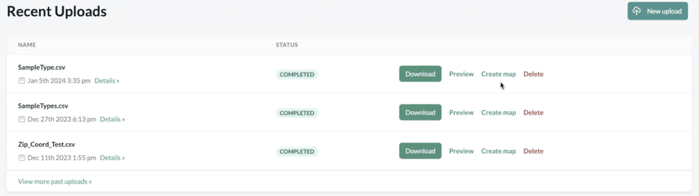
If you haven’t uploaded any spreadsheet yet, you can do so by selecting the “New Upload” tab. This will take you to our Spreadsheet Uploader tool. I’ve linked a previous tutorial on how to format and upload a spreadsheet in the description down below - just in case you need any help with this step.
Keep in mind that Geocodio Maps can only handle spreadsheets with fewer than 100,000 rows. We’ve found that this is the maximum amount of markers that we can display before performance is dramatically slowed down. As such, to ensure that you have the best possible experience, we’ve set this limit to prevent any rendering or load issues.
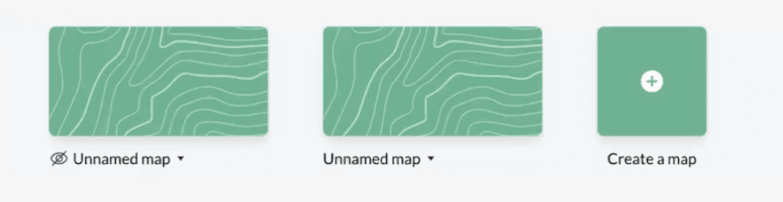
The second option to create a map is to navigate to the Maps tab on your account dashboard. This will open a menu containing all of the maps you have already generated.
You can either click on a pre-existing map or select the “Create A Map” button to start a new one. I’ll go ahead and do that now.
Adding a Spreadsheet
Once the new map has loaded, you’ll see the screen is split into two sections.
On the left, we’ll display any spreadsheet data that you’ve uploaded. This is also where you can add a new spreadsheet, add layers, and customize markers. On the right, you’ll see the visual representation of your map.
Click on the plus button at the top-left of the screen. This will provide you with two options: Add Spreadsheet or Add Layer.
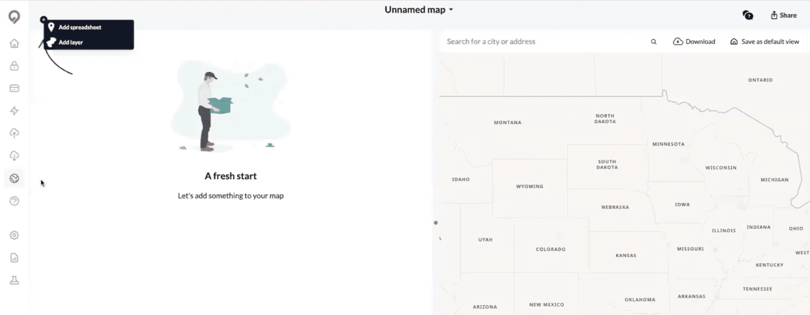
Let’s start by adding a spreadsheet.
From this menu, you can select from a list of pre-existing spreadsheets or upload a new one. In this case, I’m interested in mapping the spreadsheet "SampleType" so I’ll click “Add”.
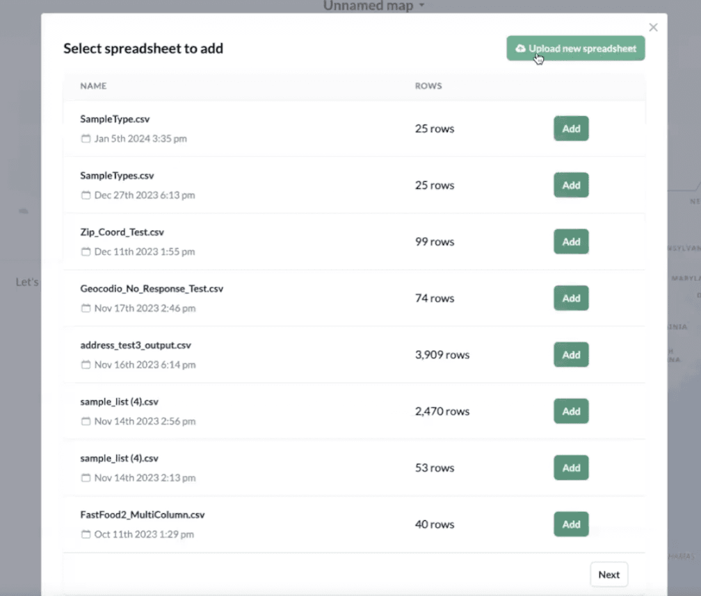
Depending on the size of your file, it might take a little bit of time to process your map.
Once it has processed, you’ll see your spreadsheet loaded on the left. On the right side, we’ll find "Alexandria, Virginia" - since that’s where the majority of my addresses are located - and zoom in closer. Markers have been placed on each of the addresses in my spreadsheet and you can see them spread throughout the city.
You can add multiple spreadsheets to a single map. Just be aware that once the total number of rows is equal to 100,000, you won’t be able to upload any more data.
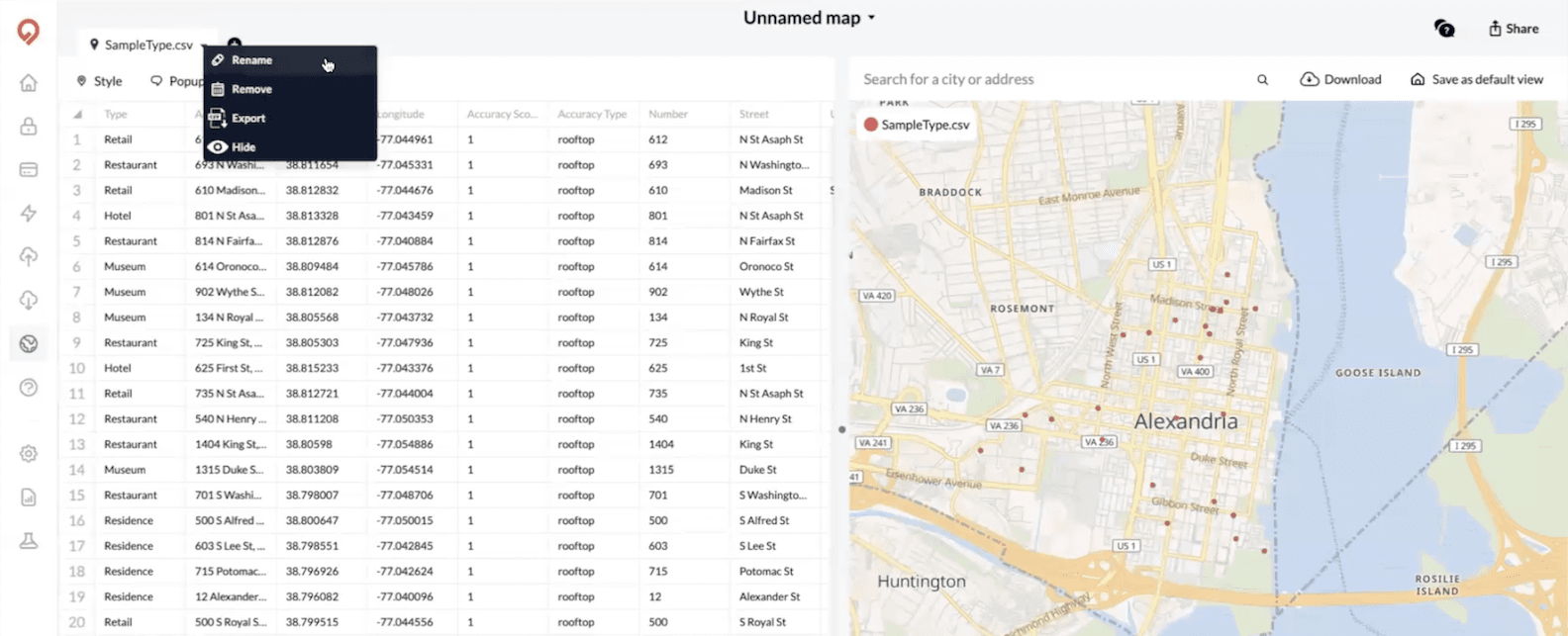
To make changes to your spreadsheet, click the downward facing arrow next to the name of the spreadsheet. Here you can choose to rename the spreadsheet, delete it from the map, export it as a CSV file or hide it from view.
At the most basic level, we’ve successfully created a map. This is awesome news!
But right now, it’s just a collection of plotted markers. Let’s customize our map to make it a little more visually appealing and useful.
Customizing Your Markers
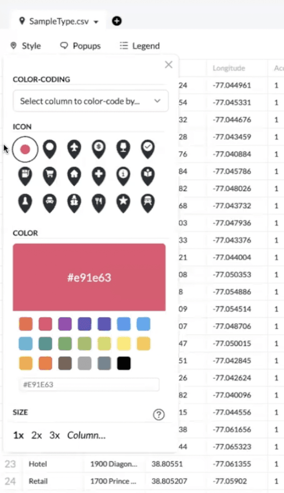
Click on the style button to open your styling menu. Here, you can change the icon, the color and the size of your markers. Right now, my markers are a little small, so I’ll make them stand out a bit by choosing the star icon, changing the color to blue and increasing the size x2.
This looks great. The markers are much more visible.
However, we can take this one step further. Right now, the markers are all identical - there is nothing to differentiate them. You may want to make your map more dynamic by categorizing the addresses into different types.
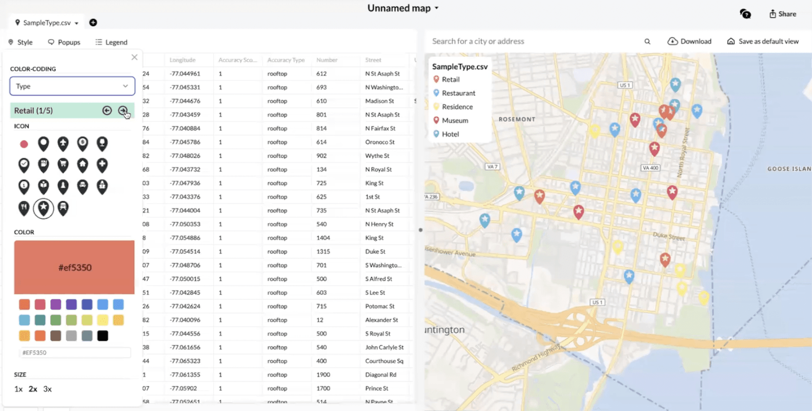
For example, the spreadsheet I’ve uploaded included a column called types that breaks down the locations into a variety of possible options: restaurants, hotels, museums, retail and residential. I can customize how each of these categories looks on the map.
At the top of the style menu, you’ll see a dropdown bar that says “Select column to color-code by…”
I want to use the “Type” column from my spreadsheet to identify my categories. The categories will automatically populate and you’ll see a paginated menu of them just beneath the dropdown.
Let’s make each of my categories unique:
- Retail will be the shopping cart icon in bright red.
- Restaurants will be the fork and knife icon in sky blue.
- Residences will be the house icon in yellow.
- Museums will be the monument icon in green.
- ...and Hotels we’ll keep as the star icon but recolor them to black.
- Let’s also say we want Hotels to stand out the most, since we’re looking to visualize the distance from hotels to these other locations. We’ll bump it up to 3x.
This is a much more useful map. Not only have we placed our markers, but we can see what types of addresses they represent via icons and color-coding.
Awesome!
Adding Pop-Ups
What if you wanted to know the actual address information of the markers we’ve plotted and styled?
You can display this information in a clickable pop-up by selecting the Pop-Ups menu.
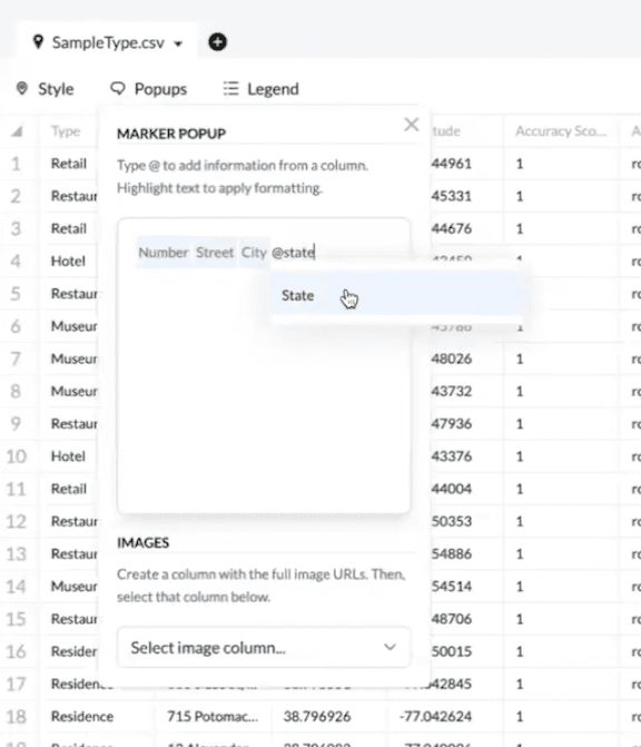
In the text box, use the @ sign, followed by the name of the column, to select which columns you would like to display to the user. I’m going to choose @number, @street, @city, @state and @zip so that I can render the whole address. You could also add additional fields, such as our type column, accuracy score, source, etc. Any column available in your spreadsheet can be rendered in a pop up.
If you have a column containing URL links to images, select the column and we’ll render those images in the pop ups as well.
Now, when you click on a marker, you’ll see the associated address.
Adding a Legend
Our last styling option is the ability to add or remove a legend from the map. When you’ve broken your markers out into different categories, the legend will help you quickly identify which marker style represents each category.
We default to including the legend. You can already see an example of what they look like in the top left corner of the map. Each of my existing marker categories is presented with their icon and color.
If you’d like to turn this option off, click on the “Legend” tab. This will open a small menu of checkboxes. To remove the legend, uncheck “Show Legend”. You can also leave the rest of the legend, but remove the name of the file from the box.
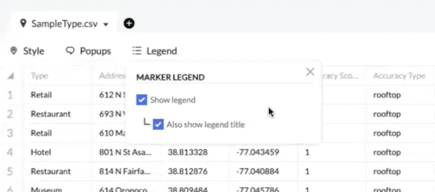
This is what I’ll go with for now because I think it gives our map a bit of a cleaner look.
Adding A Layer
Beyond markers, you can also add layers on top of your map that can identify the borders of specific regions. For example, you might want to more prominently highlight state borders or visualize the Census Tracts of a given region.
To add a layer, go back to the plus button on the top left corner of the spreadsheet section. Select “Add Layer”.
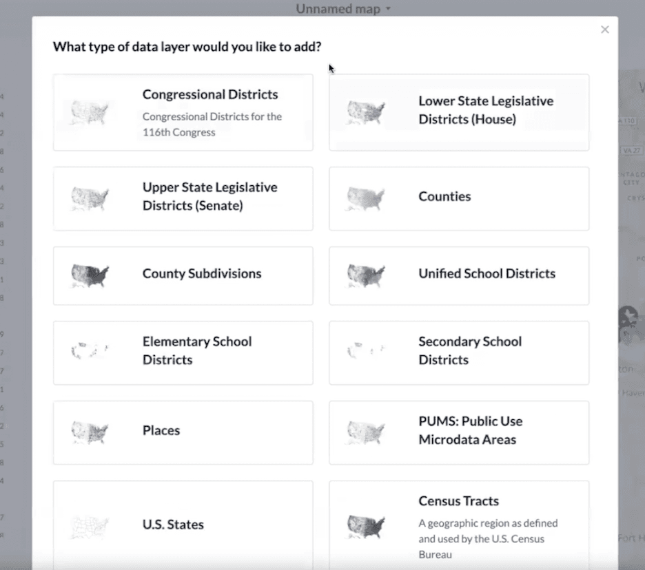
A menu will open that includes all of our layer options. You can add: Congressional Districts, Lower State Legislative Districts, Upper State Legislative Districts, Counties, County Subdivisions, Unified School Districts, Elementary School Districts, Secondary School Districts, Places, Public Use Microdata Areas, US States and Census Tracts.
I’ve selected Congressional Districts.
The new layers will appear on your map fairly quickly. They will be slightly more opaque than the initial map view. If I zoom out a little bit, you’ll be able to see the Congressional District borders a little better.
If you hover over a specific region, we’ll highlight it and tell you which area you’ve selected. All of the addresses I’ve plotted are in Congressional District 8.
Customizing Your Layers
You can also style your layers. If you click the “Style” button a menu will open with a number of options.
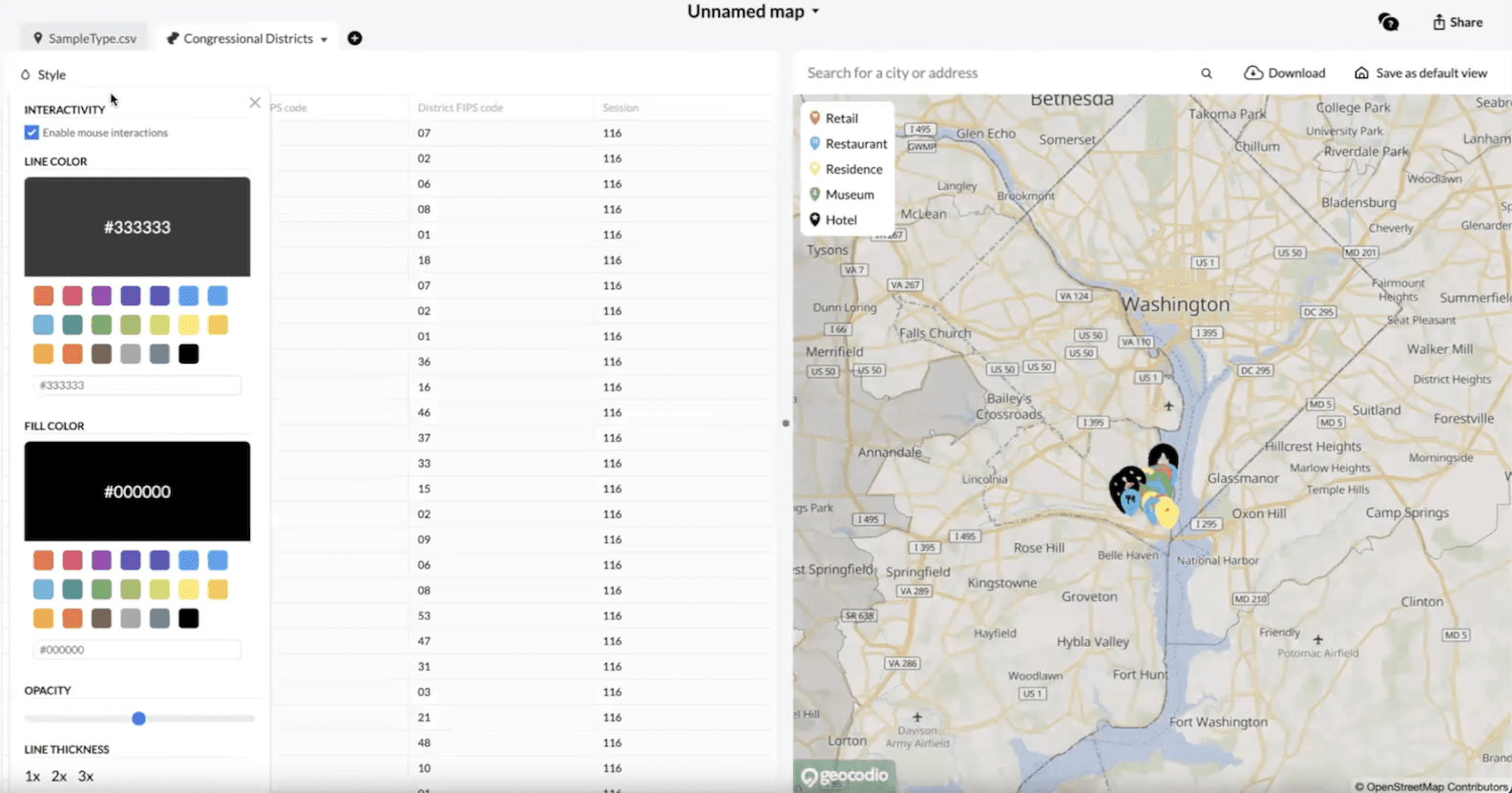
If you don’t want to highlight a layer by hovering over it, you can disable mouse interactions.
Adjust the color of the borders by choosing a new line color.
Adjust the color of the background by choosing a new fill color.
Change the opacity of the background by reducing or increasing the value on the Opacity slide bar.
Finally, you can adjust the thickness of the border lines in the same way you can change the size of the markers.
I think my map is looking pretty great!
Sharing Your Maps
But what if I want to share it?
Geocodio Maps makes sharing your map as easy as possible.
If all you need is a screenshot to send to others, you can click the “Download” button. This will download a copy of the map as a PNG file. Be aware that the scale of the screenshot will reflect exactly the dimensions of the map section.
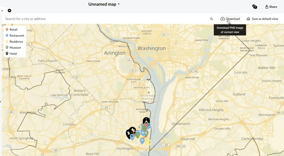
If you widen the section, you’ll get a wider screenshot. If you zoom in, the downloaded image will reflect that change. Set your map to exactly the positioning you want reflected in order to ensure the best result.
Nearby, you can also set a default view. This means that the current view will act as the default when sharing interactive maps. It will be the first thing your users see when they open it.
Let’s actually share an interactive map. Click on the “Share” button on the top right side of the screen.
You’ll be given three options. We default to keeping your map “Private” - visible only to you. You can also set it to “Hidden”, where only those with a link can see it - or “Public”, where anyone can see it.
I’ll choose “Public”.
Before you can choose how to share your map, you’ll be asked to confirm that you want to share your map. It’s just an added layer of security to prevent you from sharing any data that you may not want to. I’ll go ahead and confirm.
Once that’s taken care of, we’ll provide you with a URL that you can send to anyone to share an interactive version of your map. They’ll be able to view your markers and layers, as well as click on any interactive elements like pop-ups.
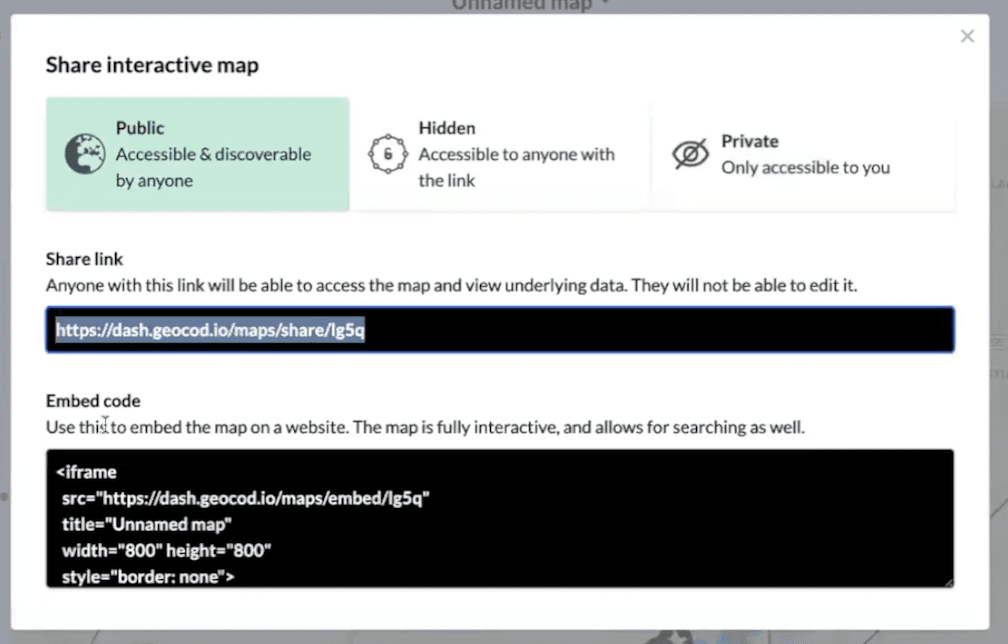
We’ve also provided HTML to easily embed the map you’ve created onto your website.
Geocoding Rows within Geocodio Maps
These are all the tools you need to create, customize and share a map, but there’s one more trick I’d like to show you.
What happens if you need to add additional markers to your map?
You could upload and add a separate spreadsheet. However, you can also add new rows to your existing spreadsheet and geocode them directly within Geocodio Maps.
Let’s go back to my SampleType spreadsheet. At the bottom, you’ll see an “Add” button along with a field to enter a number of rows. Enter however many rows you need to geocode, then click “Add”. I’m going to stick with one for now.
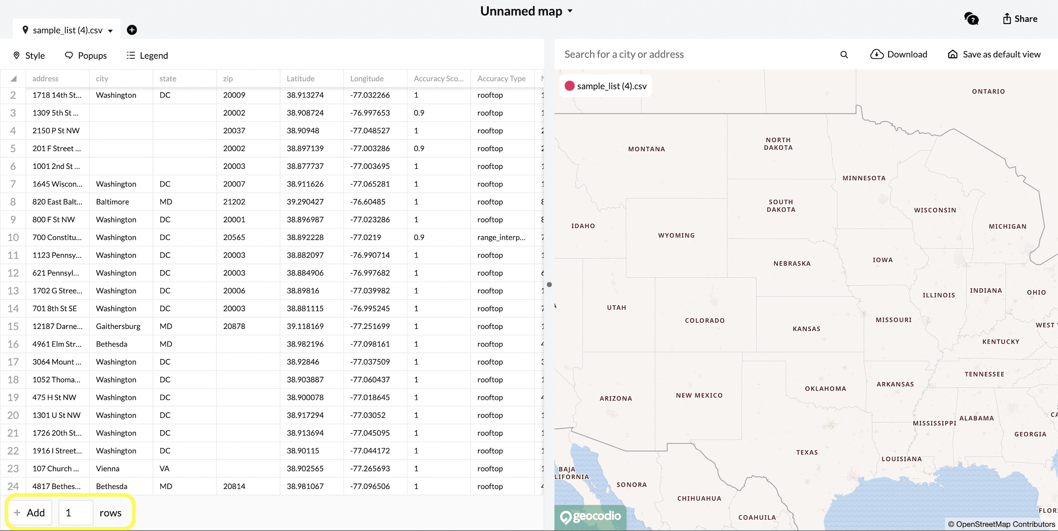
You’ll immediately see these new rows added to your spreadsheet document. They’ll be shaded in green until you save your changes.
In your new row, add the addresses to the column where you initially input them. In my case, I can also add category information in the “Type” column.
Once you’ve provided your new inputs, you can choose from three options. You can cancel the change outright. You can save the addresses, but skip geocoding - meaning that the address will appear on the document but not be mapped or counted toward your monthly lookups. Finally, you can save and geocode your rows.
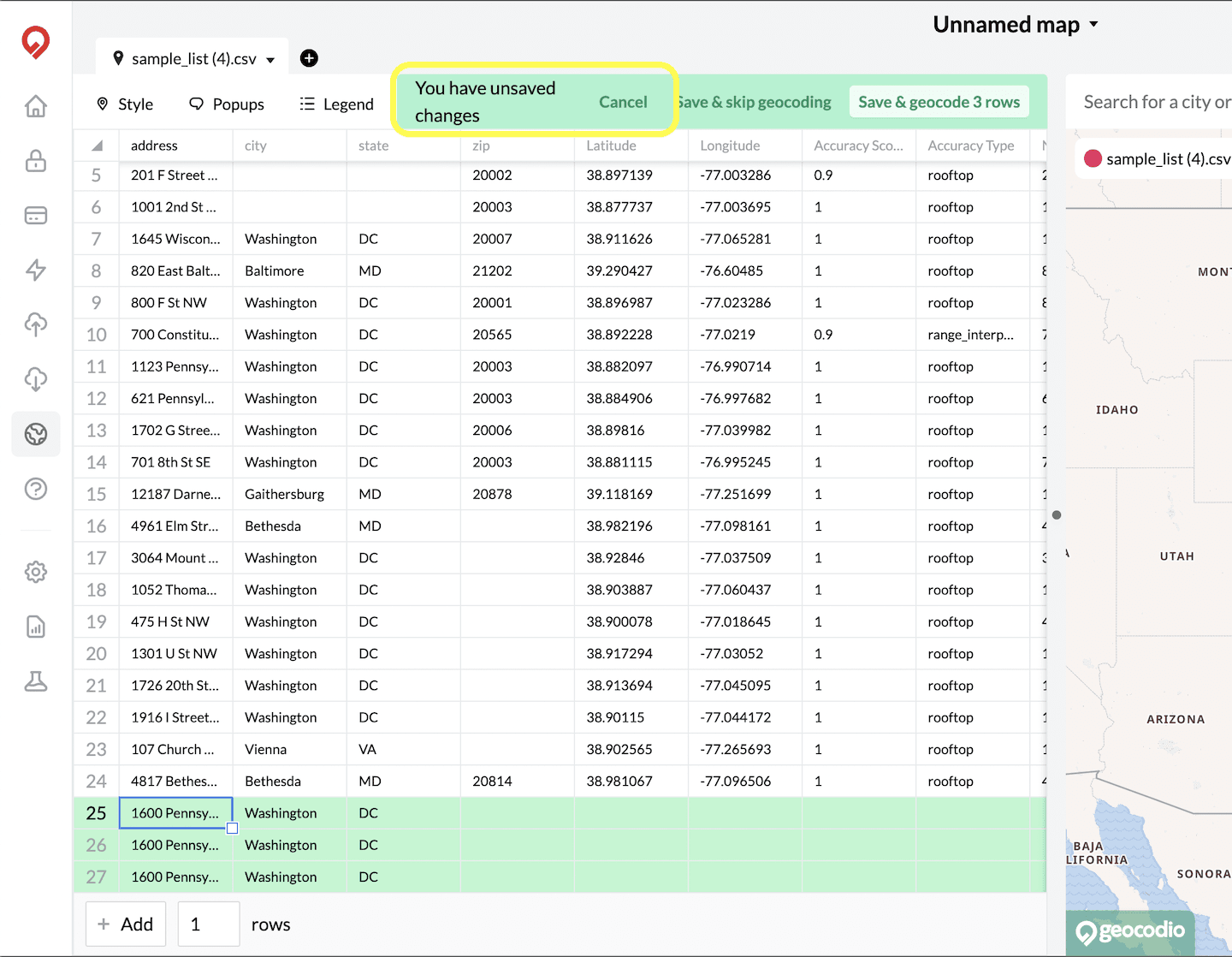
This will run our geocoder in the background, returning coordinates for the addresses you input. It may take a few moments, but once the spreadsheet has re-loaded, you’ll see that the address has been geocoded with latitude, longitude and parsed address data.
We’ll also plot the marker for this new row onto the map. If I zoom out a little bit, you’ll be able to see the new marker, correctly styled with its category.
This is a great way to add small groups of addresses without having to go to a different section of the website. However, please note that any geocoding that takes place within Geocodio Maps still counts toward your total lookups for the month and may increase the cost of your usage.
If any geocoding you do in Geocodio Maps exceeds your 2,500 free lookups per day, you’ll receive a message asking you to confirm your desire to proceed with processing your geocode request. We’ll provide an estimate of the cost that you can expect to be added when we bill for your usage on the first of the following month.
If you don’t confirm your request, we won’t geocode the rows you’ve added and the lookups will not be added to your total.
Conclusion
Feel free to try out Geocodio Maps to see if it’s a good fit for your projects. You can start creating maps right away!
I hope this has been a helpful tour. Reach out to us with any additional questions to: support@geocod.io.
Until next time, happy mapping!